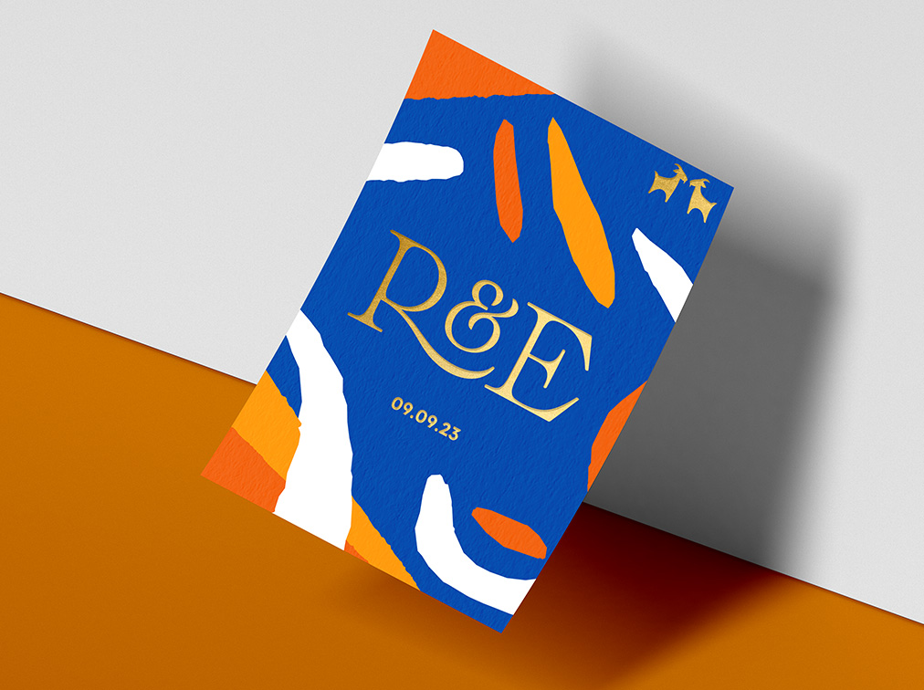
The brief for this double sided wedding invite was set by the groom-to-be, Elliott, who is in fact an artist (no pressure then!). When describing what they were looking for to set the scene for their big day his words were: angular, abstract, architectural lines and shapes in deep blue and orange with gold pops. Oh and not forgetting a nod to the exceptional coincidence of their already matching surnames, a goat emblem.
This instantly evoked so many visuals for me to play around with. Exploring several different stylistic routes, Elliott and Rossie were really happy when we settled on this design. They felt it hit the brief perfectly. It was bold, joyful and sophisticated and was a perfect fit for their contemporary city wedding and a true reflection of the couple’s unique style.
For the finer printing details, we decided to go for a thicker matte, textured card with foiling on their names and goat emblem on just the front side. The end result was truly striking and demonstrates the power of a good brief and teamwork between client and creator.


