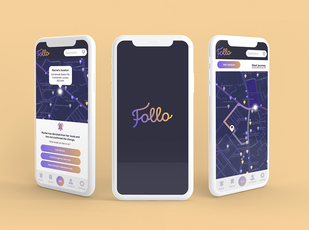
When I was approached by tech entrepreneurs Chris and Charlie to help them with some design to get their new idea off the ground and in front of investors, I jumped at the opportunity. The idea behind this product was to help people feel safe during their walking journeys and allow peace of mind to fully enjoy activities and adventures. This could be truly revolutionary if their idea was executed correctly.
As with any tech start up there are always a lot of hurdles to jump through and these things can often take time to really snowball. To get things moving, we started with a logo design for their former name, Follo (sadly this name had to be changed because of translation issues, but Becon is now shining bright!), using journey lines and being located as the core thinking behind this design. The logo was written in a soft, friendly script font with a glow point at the end of the ‘O’. We went for a deep navy to tie into night journeys, grading into a warm friendly yellow. The colour of calm and light. Finally we selected a soft, rounded, sans serif font for their core brand material that was easy to read, suitable for digital applications and friendly in appearance. The designs were then used to start to piece together how the app would look and function considering the user at every point in their journey and how these journeys could differ.
Becon is now the no1 safety app to protect any journey or activity! They received investment and have had incredible feedback from Marie Claire, Forbes, The Metro and many more.
I’m continuing to produce design material for them and it’s always such a pleasure working with the innovative team at Becon.

